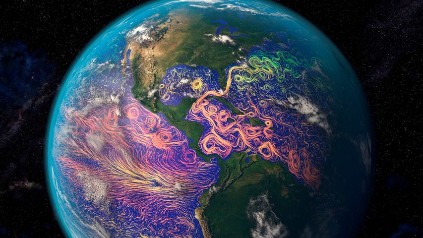
Satellite-based graphic showing ocean currents off the Americas
© Karsten Schneider/Science Photo Library
Satellite-based graphic showing ocean currents off the Americas
It’s easy to think of satellites as technology for observing the realms beyond our planet. But many satellites turn their data-gathering instruments back toward home. That’s how this ocean-currents map was created. The purple and pink swirls represent warmer ocean currents, while the blue and green are cooler currents. Maps like these aid in weather forecasting, determining the temperature of our oceans and long-term analysis of the oceans’ health.

 Barrier reef off Grande Terre, New Caledonia, France
 Porto Flavia, Sulcis-Iglesiente, Sardinia, Italy
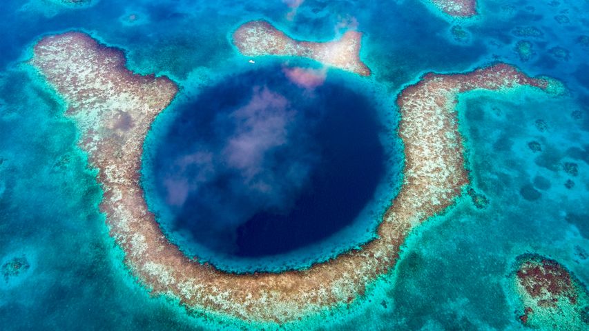
 Great Blue Hole, Belize
 Mototi octopus, Lembeh Strait, Indonesia
 Mid-Autumn Festival in Gardens by the Bay, Singapore
 Dolphin pod near Réunion island, Indian Ocean, overseas department of France
 Toronto city skyline seen from Lake Ontario, Canada
 Bicycles in Copenhagen, Denmark


